The Cookie Lady’s Daughter
Rebranding | Illustration | Marketing Assets | Iconography
Veronica, owner & founder of ‘The Cookie' Lady’s Daughter’, came to me looking to rebrand her company. She wanted something that spoke more to her brand and personality; professional, fun, and creative compared to her original logo. Without knowing what her company does, her original logo hinted that she makes cookies - when in fact her business is more about decorating the cookies.
Her market targeted parents and families but also needed to appeal to children. I worked with her closely on building out brand guidelines using both, then we broke it out into other marketing collateral pieces.
Moodboard ||
Clean branding with pops of color and shapes to make it more youthful and fun. Simple icons with added colors to give it more personality.
Final Designs ||
It was important for Veronica to have a type and an ‘icon logo’. The traditional cookie shape of a gingerbread man mixed with them holding the frosting pipe was the perfect mix and opened the doors into more icon illustrations.
Packaging + Collateral ||
The Cookie Lady’s Daughter did most of their business through events and pop-ups. She would compliment that through pick up orders at her bakery. Veronica needed something that was easy to pack, while providing instructions for the ‘at home’ kit. We decided on a fully recycled kraft box printed with sustainable ink. The exterior was covered in a few of her brand stickers that she would place as she was packing orders. Leaning into the spontaneity and whimsical-ness of her brand. The interior had a ’thank you’ card that doubled as instructions on the back.
Branding Assets ||
It was important for Veronica to have a type and an ‘icon logo’. The traditional cookie shape of a gingerbread man mixed with them holding the frosting pipe was the perfect mix and opened the doors into more icon illustrations.
Response + Go Live ||
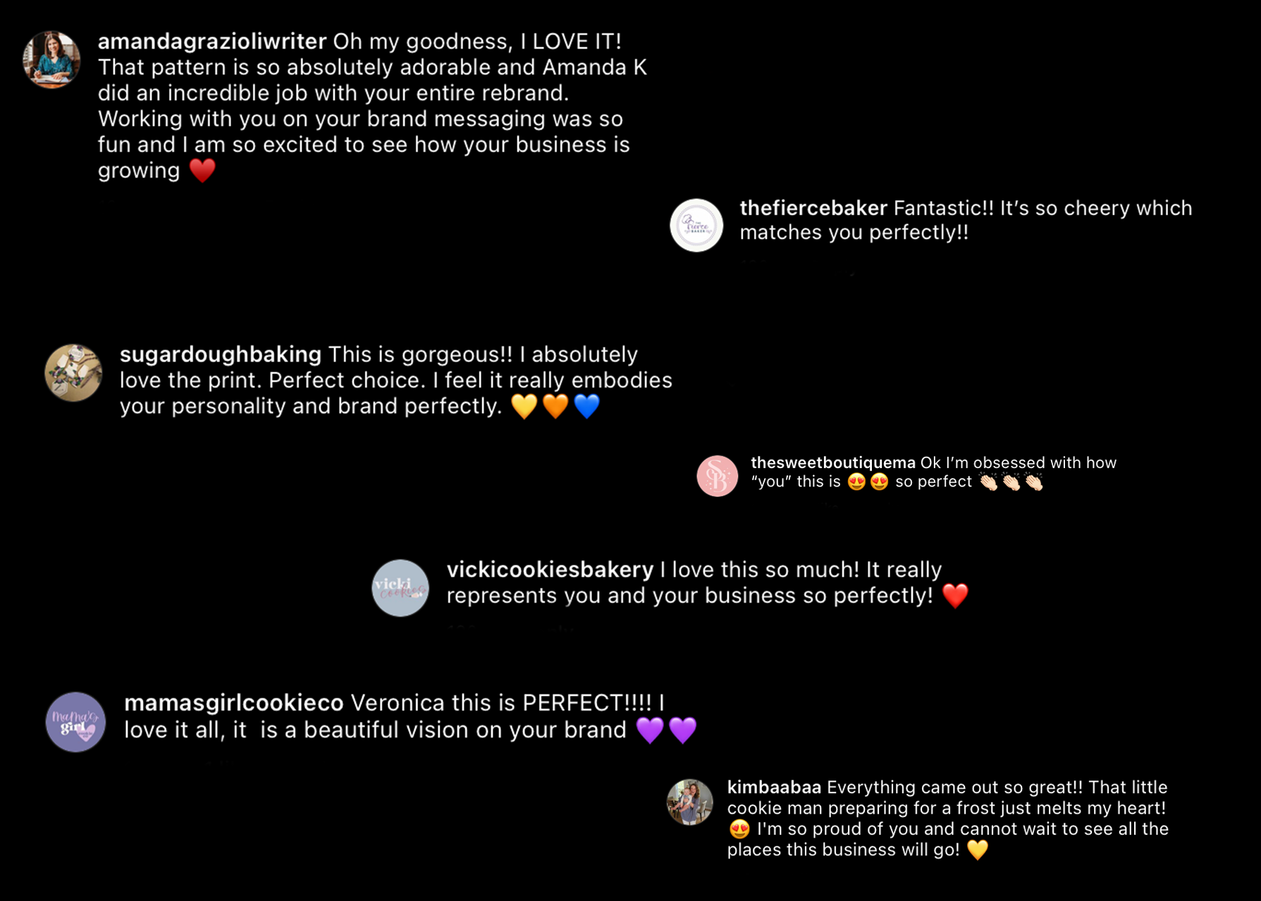
Not only did Veronica fall in love with the branding but her community did too.
